Industry Trends | April 16, 2024
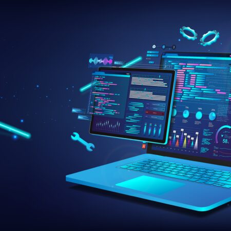
The UI Ecosystem: Building Blocks of the Desktop Superapp In this post, learn more about the technological revolution of the Desktop Superapp. Our guest bloggers cover the UI Ecosystem, which is one of the four critical pillars along with Interoperability, seamless user experience and governance.